


GRAPHIC DESIGNER
NAARM
Versatile graphic designer who loves to create
(Motion design by Tash Sparke)
-
![]()
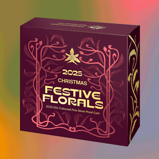
PACKAGING DESIGN | ILLUSTRATION | 'Festive Florals' for Royal Australian Mint
-
![]()
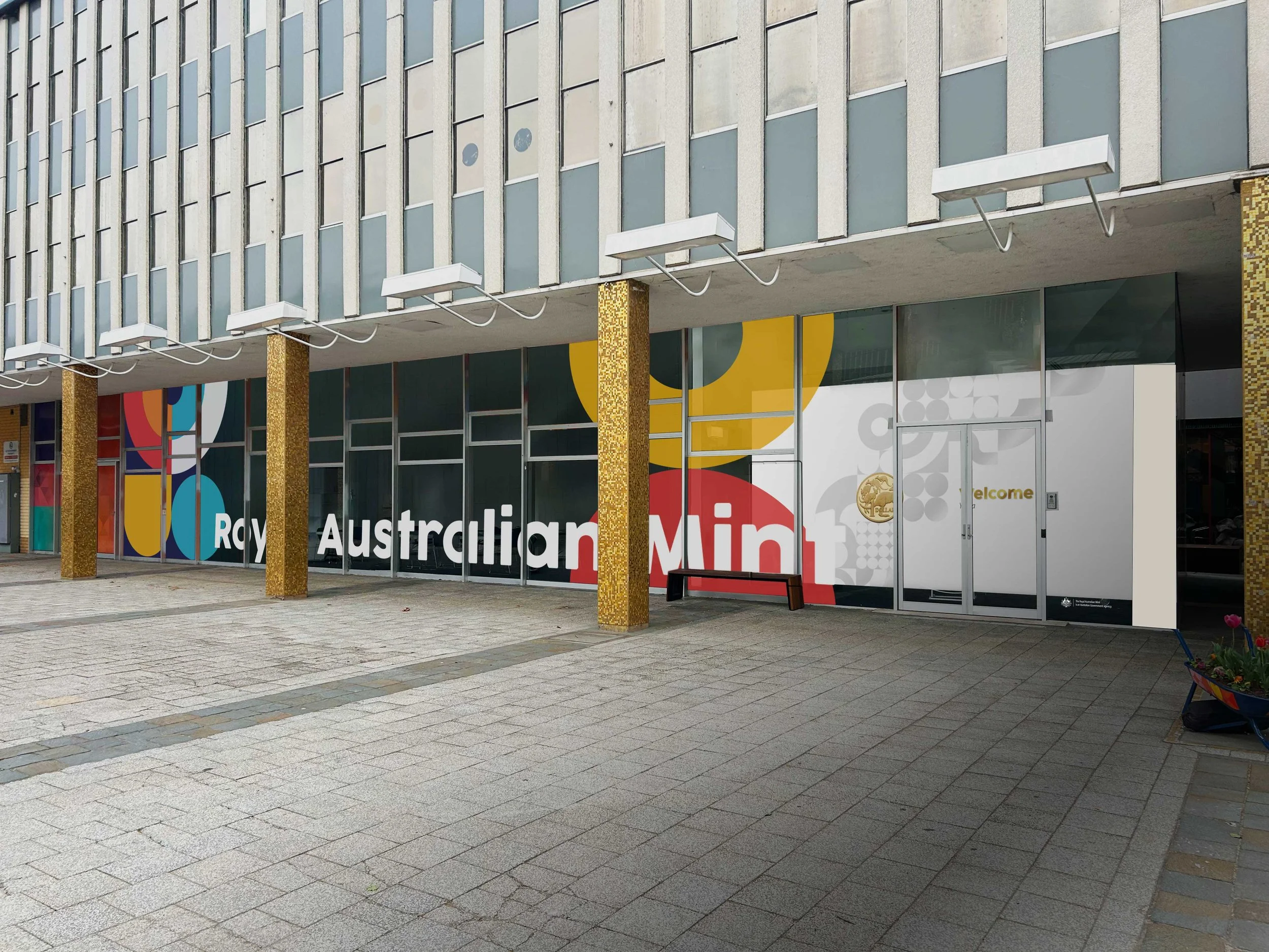
STORE GRAPHICS FIT-OUT | Pop-up shop for Royal Australian Mint
-
![]()
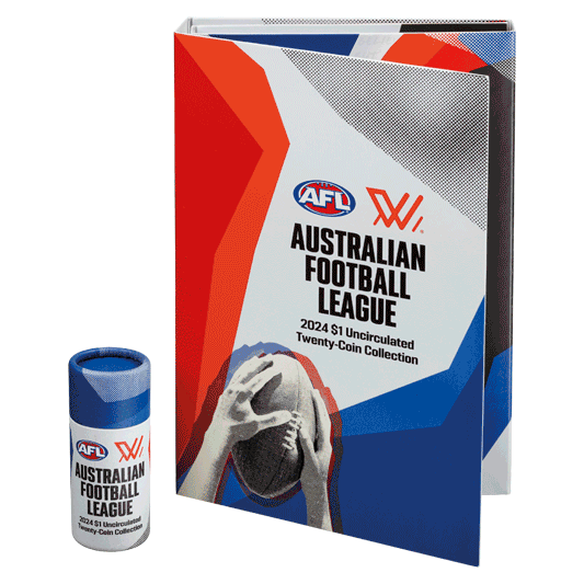
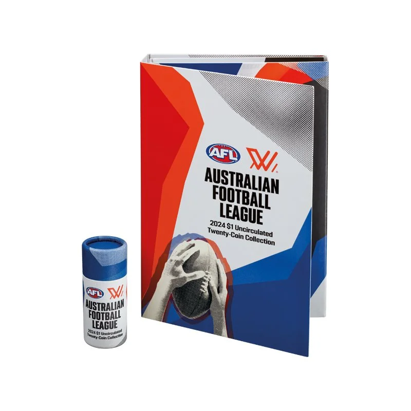
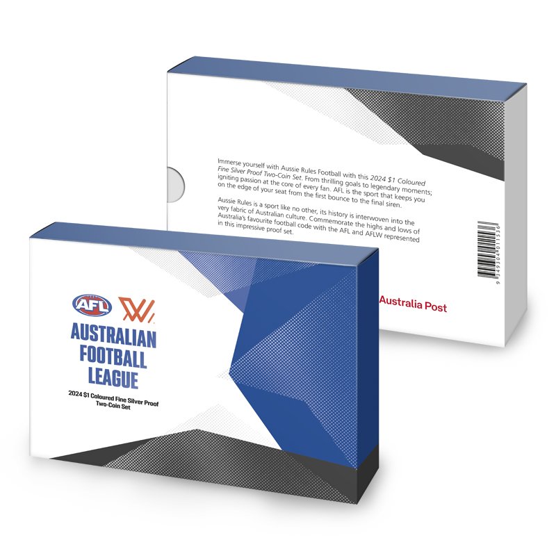
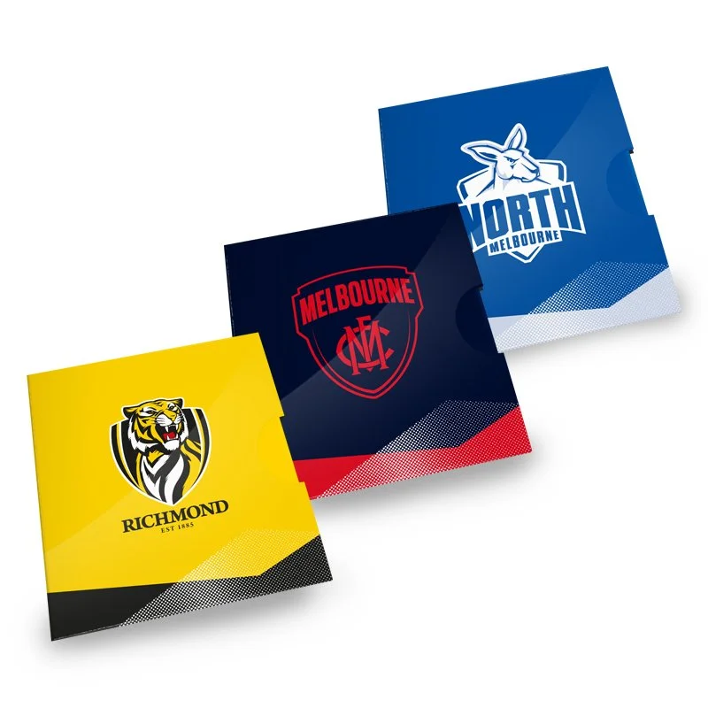
PACKAGING DESIGN | AFL for Royal Australian Mint
-
![]()
ILLUSTRATION | ADOBE ILLUSTRATOR BRUSH CREATION | Lino-cut style Aussie animals for personal project
-
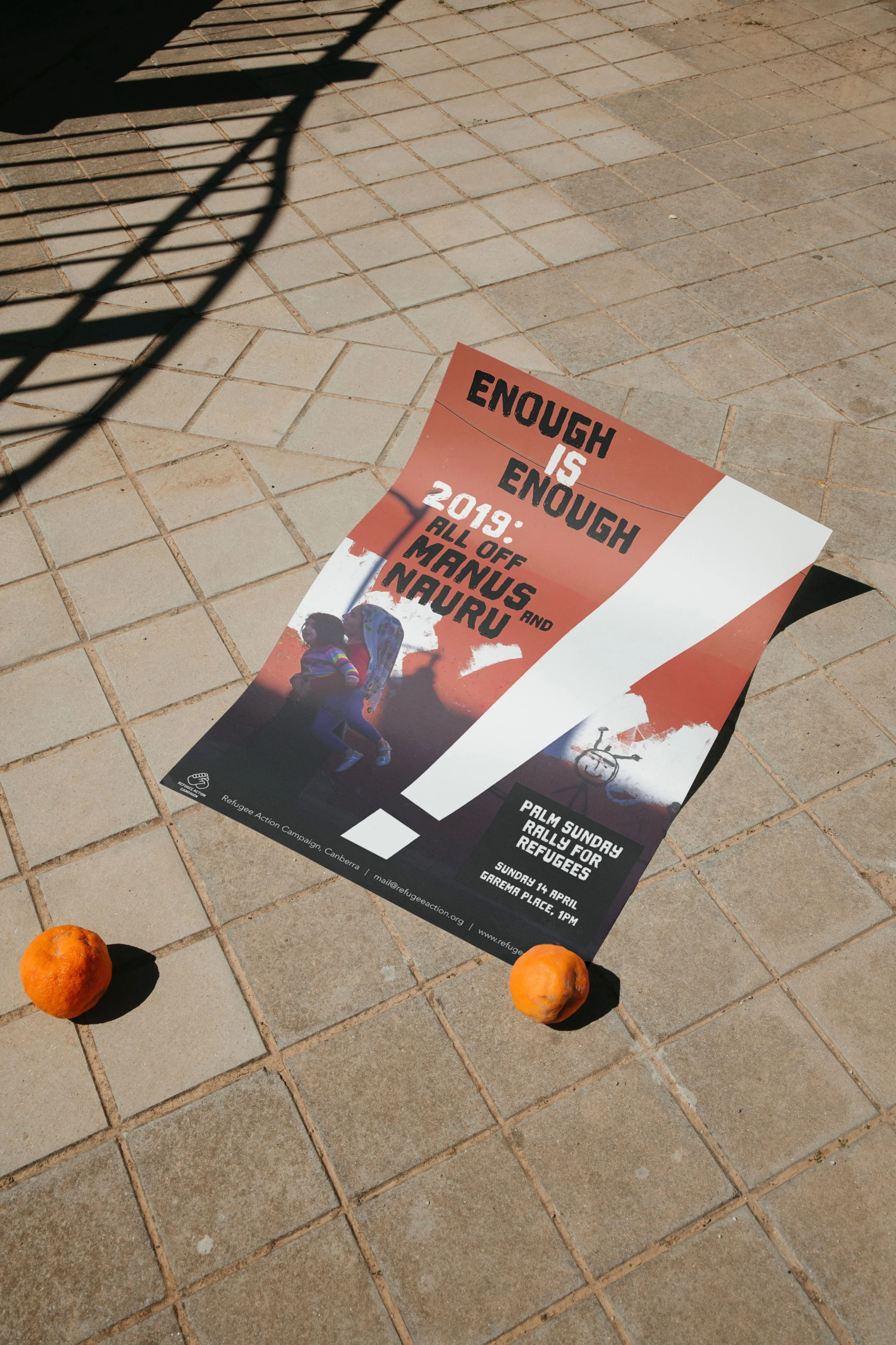
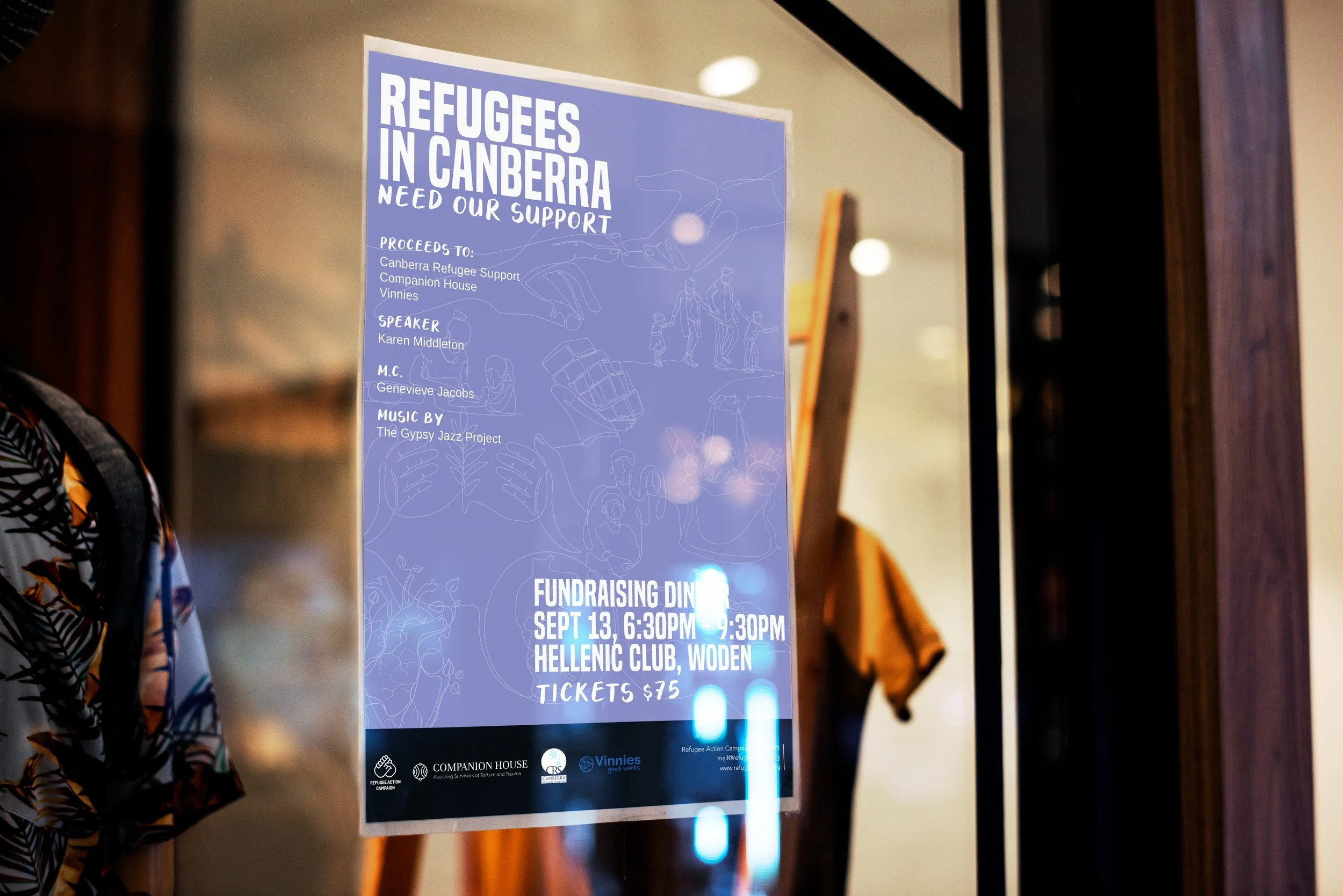
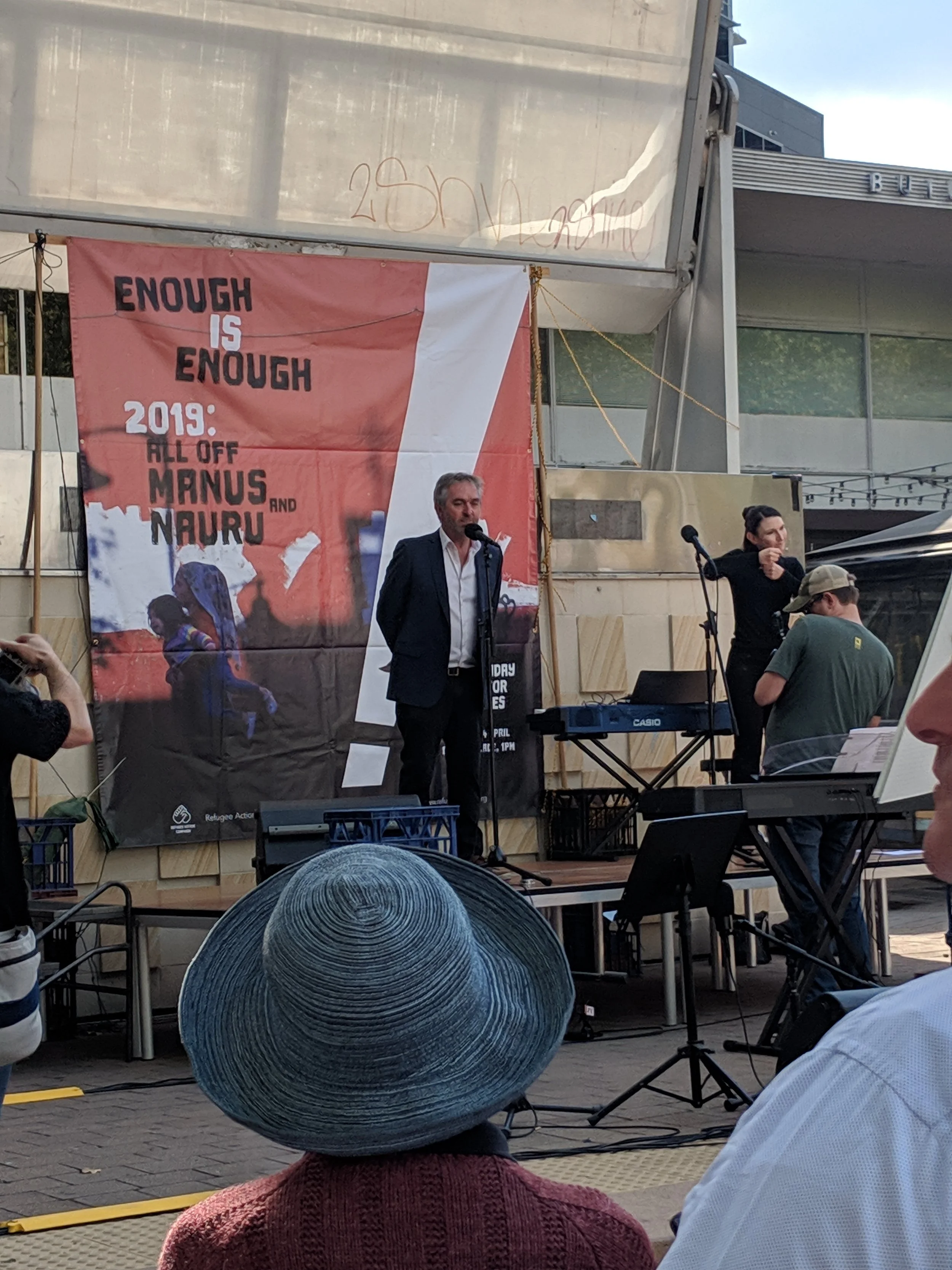
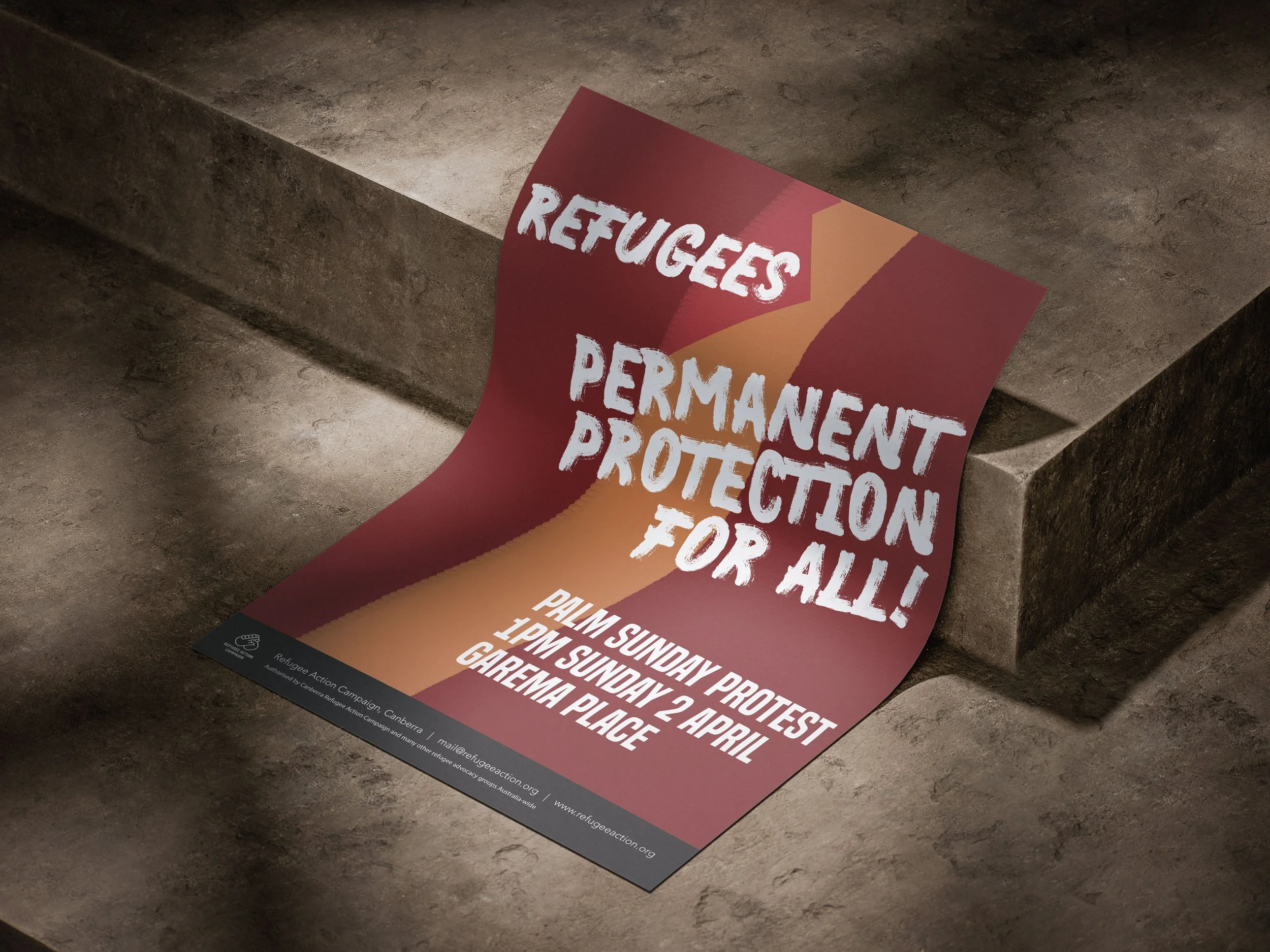
![Animated GIF shows a variety of posters created for various Canberra Refugee Action Campaign's rallies and events]()
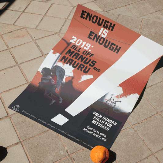
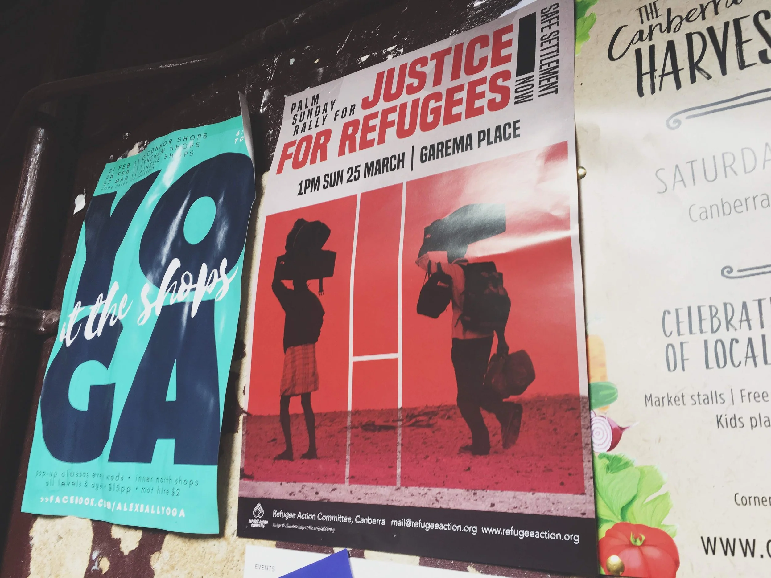
CAMPAIGN DESIGN | Palm Sunday Rallies for Canberra Refugee Action Campaign
-
![]()
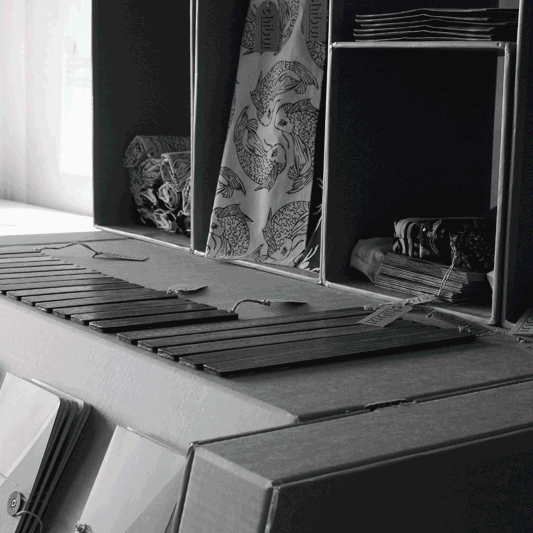
ILLUSTRATION | PRODUCT DESIGN | BRAND DESIGN | SCREEN-PRINTING | 'Shibui'
-
![]()
PUBLICATION DESIGN | PROJECT MANAGEMENT | 2024-25 Annual Report for Royal Australian Mint
-
![]()
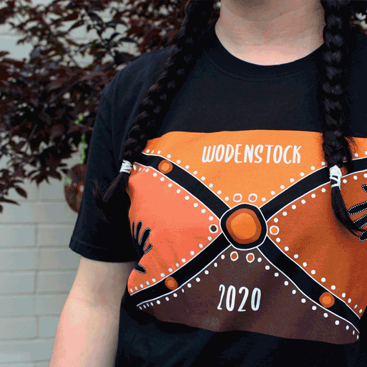
APPAREL DESIGN | 'Wodenstock' for The Woden School & 'Out Of This World' for Royal Australian Mint


Some portfolio highlights below
Some portfolio highlights below
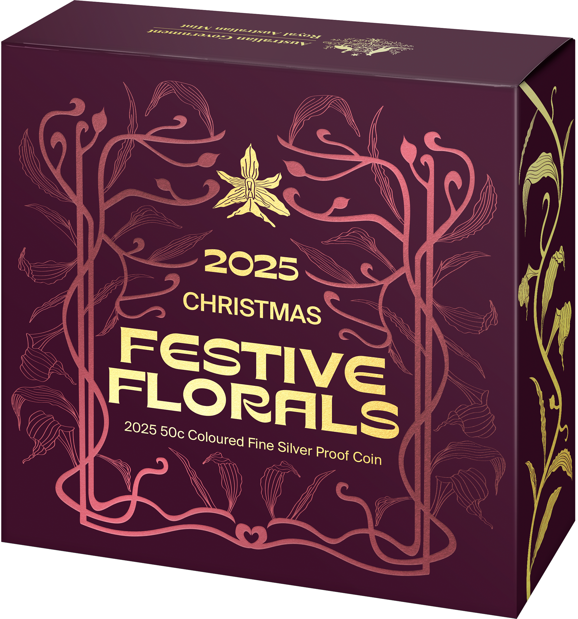
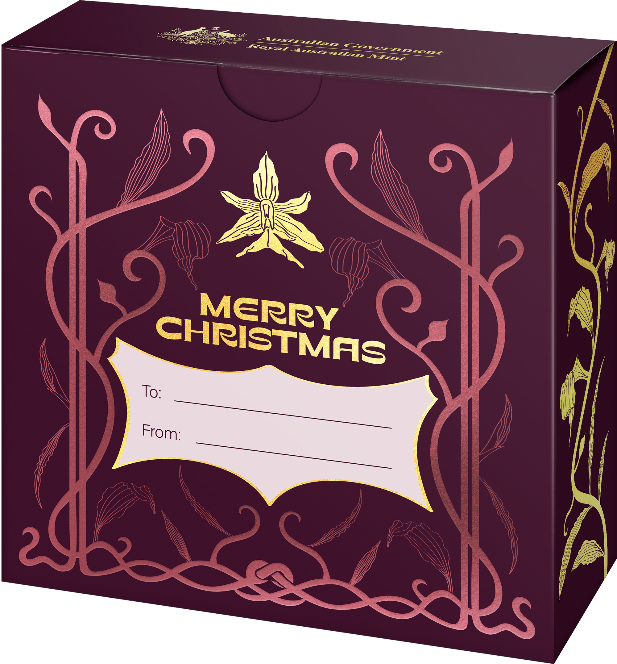
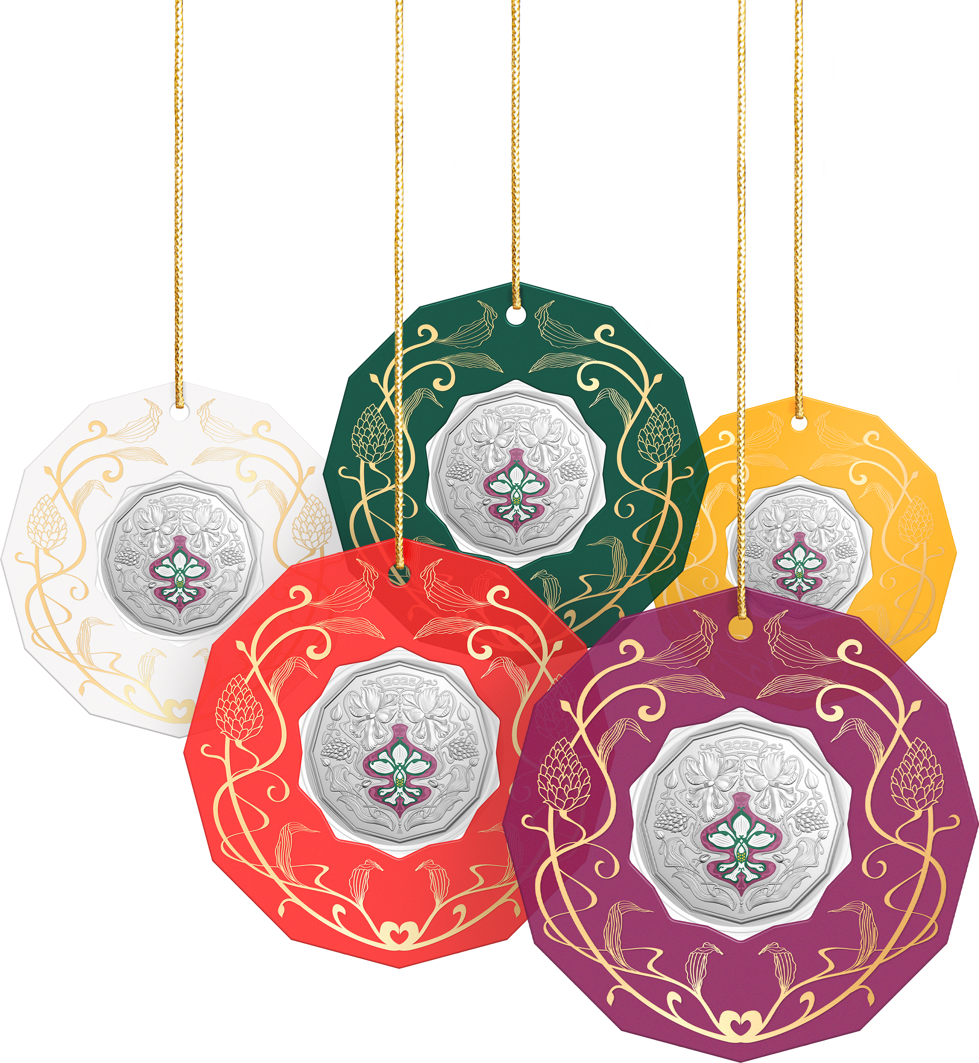
Festive Florals
Packaging design | Illustration
Client
Royal Australian Mint
Year
2025
This project is the third in a series titled ‘Festive Florals’, which highlights a different Australian flora each year that blooms around Christmas time. The brief for this project called for a festive, art nouveau inspired design. I collated several moodboards, researching different art directions. In collaboration with the coin designer, design lead, and product development, we landed on an appropriate art direction.
I sketched, and then digitally illustrated, the art nouveau components that were foiled on the finished products. The foiled components on the front of the proof packaging mimic the shape of a Christmas tree.
The colour palette for the polypropylene tree decorations needed to fit within the more traditional Christmas theme (i.e. red, green, white), whilst having room to add colours that reflected Australian Christmas/linked back to the Australian flora highlighted on the coin. The flower on this years’ coin was the Queensland Christmas Orchid, so a bright yellow was selected to link to the flowers’ inner colour. A deep mulberry was selected to reflect some celebratory Christmas imagery (e.g. wine, summer cherries).
All product imagery shown is credited to the Royal Australian Mint, displayed here with their permission.
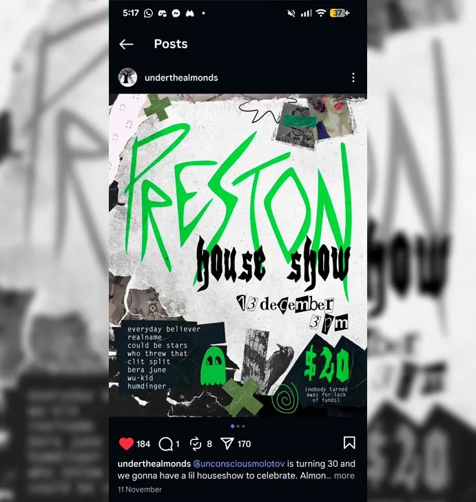
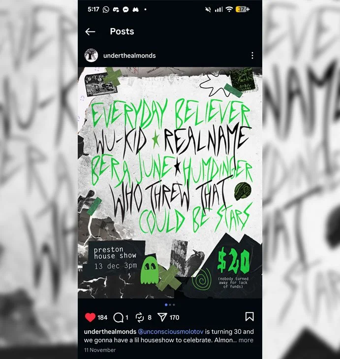
Preston House Party
Digital poster design | Typeface design
Client
Unconscious Molotov
Year
2025
The brief for this job was a digital poster design to advertise an upcoming house party in Preston, Naarm. This design called for some emo-inspired graphics - think of scrapbook ‘cut-and-paste’ aesthetic - as this matched the theme of all the artists playing in the line-up. Unconscious Molotov sent me some aesthetic references they liked, and I created some moodboard and artwork iterations from there. The typefaces I was searching through weren’t quite hitting the mark, so I instead created some custom letters to make up the band names.
I crafted the typeface used in the band line-up in Adobe Illustrator, drawing from emo/punk references. The goal was a scratchy, sharp looking aesthetic to fit the vibe of the music.
Adding in a bunch of scrapbook elements (some manually scanned in, others acquired digitally), textures, and some scraggly digital illustrations helped tie it all together.
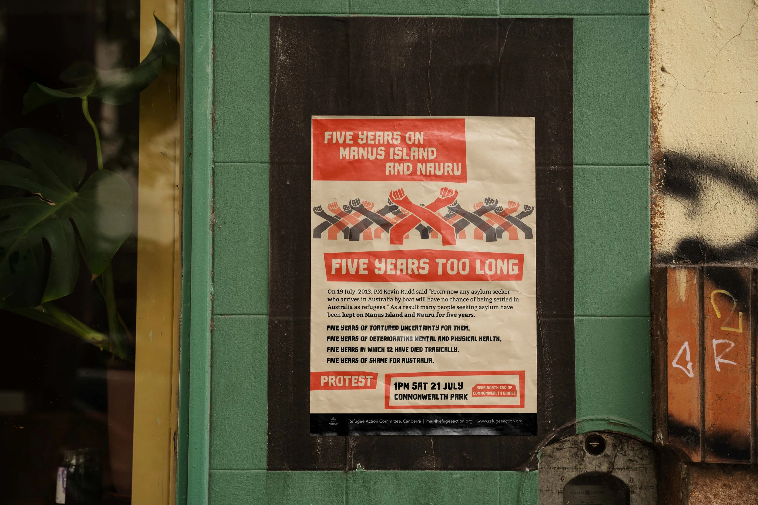
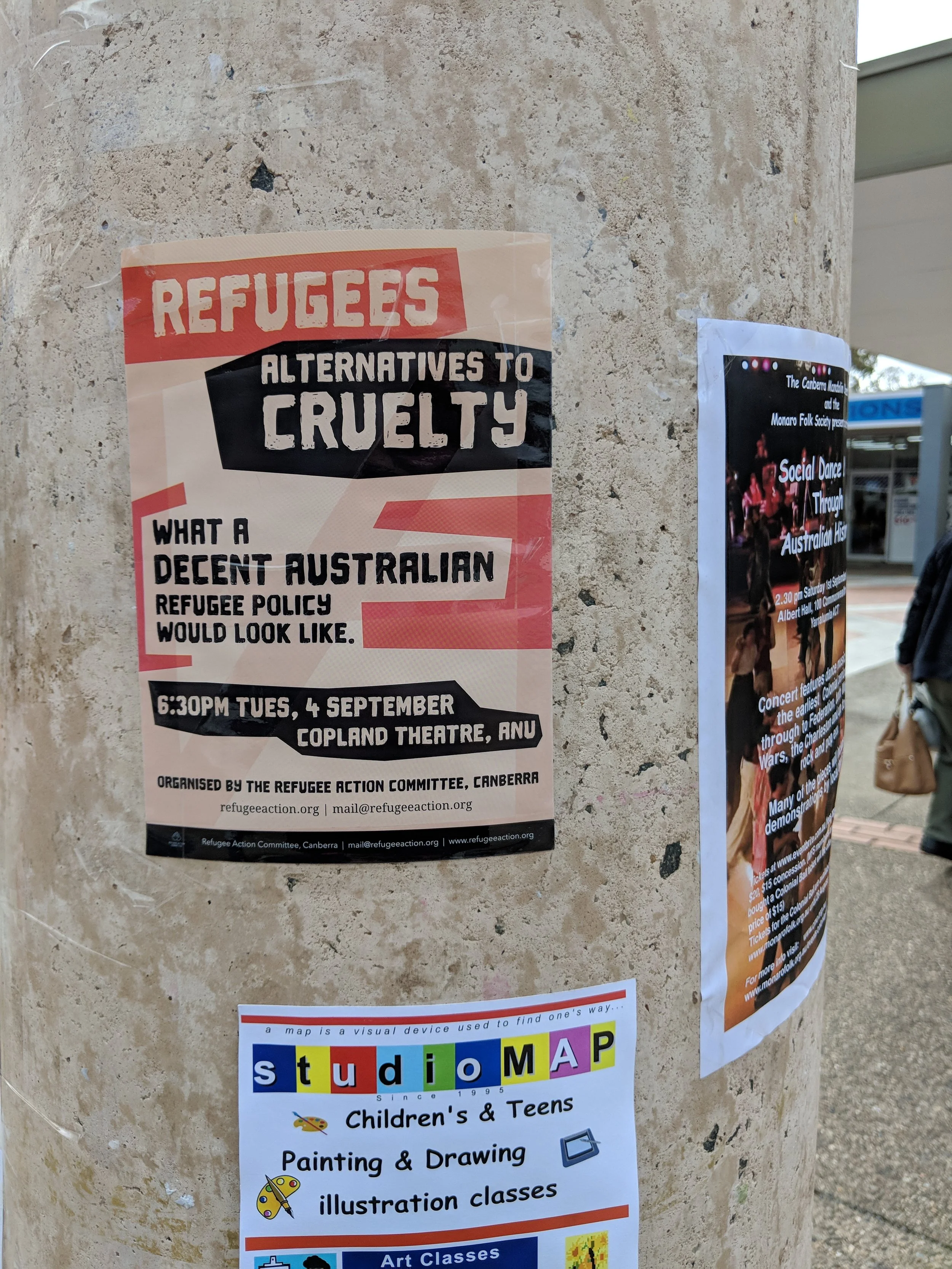
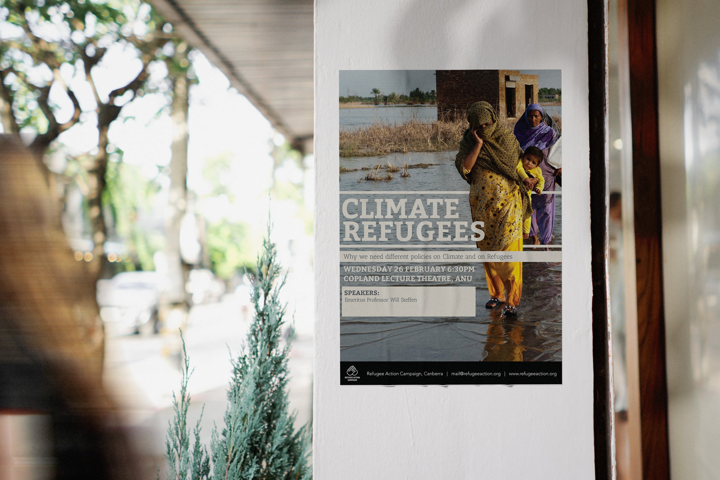
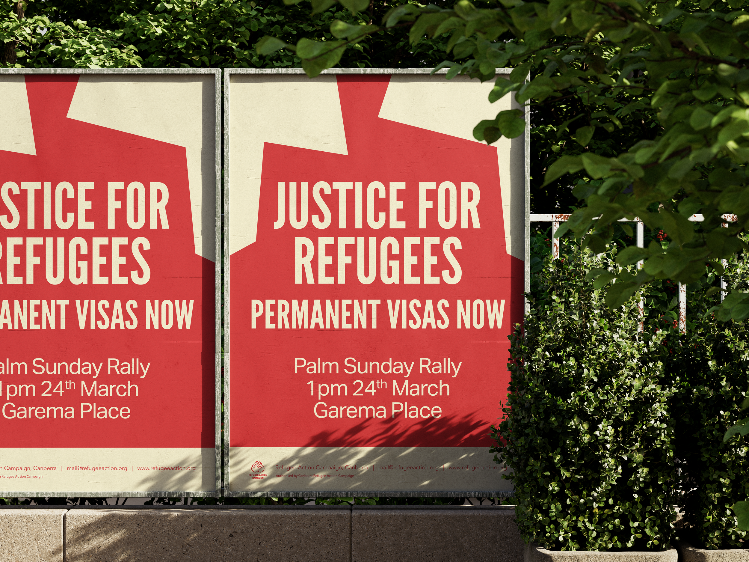
Canberra Refugee Action Campaign
Client
Canberra Refugee Action Campaign
Year
2017 - 2024
Campaign designs
The Canberra Refugee Action Campaign is an organisation campaigning for a just and humane refugee policy. They are part of a non-partisan network of concerned citizens around the country seeking fair and humane treatment of refugees in Australia.
From 2017 - 2024 I volunteered my skills to design campaign materials that spanned across print and digital mediums for many of their events. I worked on event activations with them (for example - the ‘Welcome Space’ in 2017 - an art exhibition/48 Hour Vigil set up in Civic Square that I designed promotional materials and infographics for), as well as numerous rallies and protest events. Sometimes these designs would then be templated for use across nation-wide refugee action groups, especially for the Palm Sunday rallies.
Each campaign design would span across several different digital and print formats such as corflute roadside signage, local magazine and newspaper advertisements, social media, website advertisements, posters, and flyers.


Australian Football League
Client
Royal Australian Mint
Year
2024
Packaging design
This was a packaging project designed for the Royal Australian Mint’s second collaboration with the AFL. The brief was to design a line of packaging for a twenty-coin collection folder and tube, 18 individual team coin wallets, and cartons for two different proof finish coins.
I used abstract, sharp-edged coloured shapes to represent the movement and high intensity of a match. I wanted to highlight the story of how watching a match makes someone feel - full of energy and excitement - and how the rich history of the sport has made viewers feel this way since the 1800’s. I used a halftone texture and commentary excerpts from matches to tie the history into the design.
Each team has their own distinctive branding, which lends itself well to creating recognisable packaging for each of the individual team coins. The shapes and halftone vector were used to create cohesion between these individual wallets and the main packaging components.
This product line was released through partnership with Australia Post outlets.
All product imagery shown is credited to the Royal Australian Mint, displayed here with their permission.

Tuned by Sam
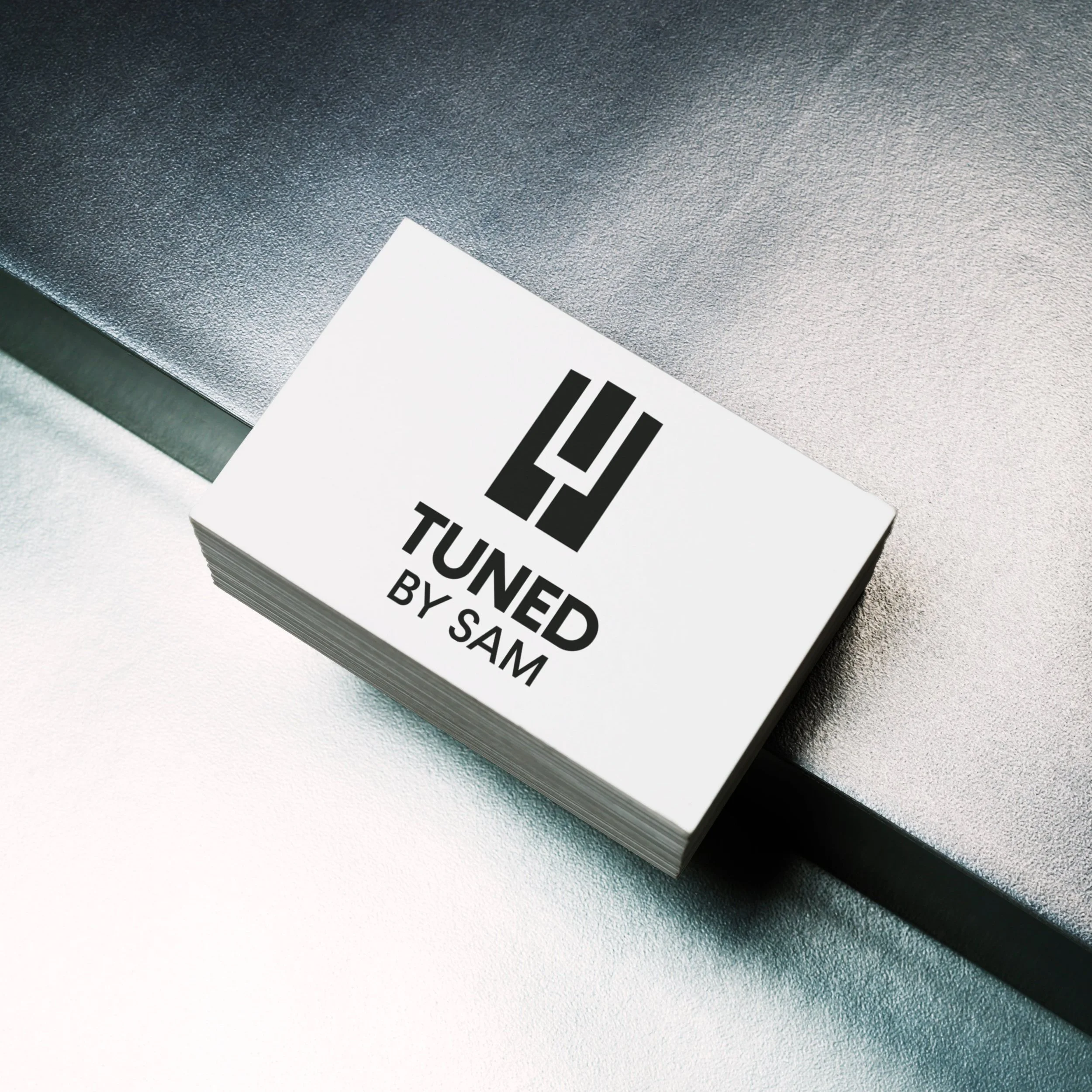
Client
Tuned by Sam
Year
2025
Logomark
Tuned by Sam is a small piano tuning business based in Hobart, Tasmania. Sam wanted a logo developed to promote his business - initially to be used on business cards, then on different mediums as his business grows. I worked with Sam to explore future branding options for him down the line, to ensure the logomark could adapt easily to suit his evolving design needs.
Sam wanted his logomark to communicate professionalism in a simple, elegant, yet approachable way. I conducted some research on his closest competitors to ensure his logomark would stand on its’ own. A lot of the piano tuners in Hobart are slowly aging out of the profession, and it lended us well to design a mark with a more contemporary feel - increasing its’ longevity.
The final logo chosen represents keys on a piano and a tuning fork within the negative space.